Question 4 Tutorial 1 ECON3102 2021
About this post
This post is created to quickly demonstrate one of the possible answer of question 4 of tutorial 1 of ECON3102. I chose to use r’s WDI to show it but any other software and any other source of data can be used obviously. The reason why I use WDI is because it is convinient and easy to show some graph. If we use World Development Indicators we don’t even need to download it. Just use its graph function which is super convinient.
some packages:
library('WDI')
library('ggplot2')
library('tidyverse')
## -- Attaching packages --------------------------------------- tidyverse 1.3.1 --
## v tibble 3.1.2 v dplyr 1.0.7
## v tidyr 1.1.3 v stringr 1.4.0
## v readr 1.4.0 v forcats 0.5.1
## v purrr 0.3.4
## -- Conflicts ------------------------------------------ tidyverse_conflicts() --
## x dplyr::filter() masks stats::filter()
## x dplyr::lag() masks stats::lag()
library('ggdark')
library('patchwork')
A bit of aesthetic:
graph<-ggplot()+
dark_theme_bw(base_size=16)+
theme(text = element_text(color='#e0e0e0'),
panel.border = element_blank(),
panel.grid.major = element_blank(),
panel.grid.minor = element_blank(),
axis.line = element_line(colour = "#e0e0e0"))
## Inverted geom defaults of fill and color/colour.
## To change them back, use invert_geom_defaults().
The question itself consist of two parts. Students are to find, download and sketch numbers for two countries: one is developed one while the other is an emerging economy. In this example, I use Indonesia and Australia.
There are two sub-questions in this exercise. The first one is to plot real GDP and show a bit of a business cycle (which I will do by showing GDP growth)
Question One
Real GDP
Quickly browse website of World Development Indicators to get all keys needed for the WDI package.
let’s check out real GDP.
realgdp<-as_tibble(WDI(indicator = 'NY.GDP.MKTP.KD',country = c('IDN','AUS')))
realgdp
## # A tibble: 122 x 4
## iso2c country NY.GDP.MKTP.KD year
## <chr> <chr> <dbl> <int>
## 1 AU Australia 1.45e12 2020
## 2 AU Australia 1.45e12 2019
## 3 AU Australia 1.42e12 2018
## 4 AU Australia 1.38e12 2017
## 5 AU Australia 1.35e12 2016
## 6 AU Australia 1.31e12 2015
## 7 AU Australia 1.28e12 2014
## 8 AU Australia 1.25e12 2013
## 9 AU Australia 1.22e12 2012
## 10 AU Australia 1.17e12 2011
## # ... with 112 more rows
Which only shows top 10 which contain Aussie. If we plot ’em:
graph+geom_line(data=realgdp, aes(x=year, y=NY.GDP.MKTP.KD,color=country),size=1.1)+
labs(title = 'Fig 1. Real GDP, Indonesia and Australia, 1960 - 2020',caption='source: World Development Indicators')+
ylab('2010 USD')+geom_vline(xintercept=c(2009,1998,1983))
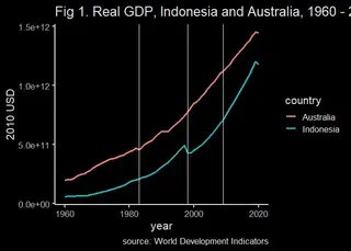
Real GDP are going up for both countries. Note that, while generally the graph goes up, but it has some ‘brakes’ for a short while. There are 1980s oil crisis which apparently struck Australia a bit more. There’s also something in 90s that hit Aussies. Asian Financial Crisis in 1998 definitely crushed Indonesian economy. The GFC do affect Australia a bit but not as bad as the northern hemisphere.
Also, Indonesia seems to be able to catch up with Aussie (note the relatively smaller gap in the late 2010s). Is it a converge? It remains to be seen.
Also, f#ck COVID-19.
GDP growth
While I spoke a bit about business cycle in some points, seeing GDP growth give us better picture.
First we get GDP growth and calculate arithmatic mean of them. (for the sake of the graph. You should really use geometric mean if you want to calculate mean growth rate.)
gdpg<-as_tibble(WDI(indicator = 'NY.GDP.MKTP.KD.ZG',country = c('IDN','AUS'),start=1961))
growth<-tibble(
country = c('Australia','Indonesia'),
mean_growth = c(mean(gdpg$NY.GDP.MKTP.KD.ZG[gdpg$country=='Australia']),
mean(gdpg$NY.GDP.MKTP.KD.ZG[gdpg$country=='Indonesia']))
)
growth
## # A tibble: 2 x 2
## country mean_growth
## <chr> <dbl>
## 1 Australia 3.38
## 2 Indonesia 5.13
graph+geom_line(data=gdpg, aes(x=year, y=NY.GDP.MKTP.KD.ZG,color=country),size=1.1)+
labs(title = 'Fig 2. GDP growth, Indonesia and Australia, 1960 - 2020',caption='source: World Development Indicators')+
ylab('%')+
geom_hline(yintercept = 0) +
geom_hline(yintercept = as.numeric(growth[1,2])) +
geom_hline(yintercept = as.numeric(growth[2,2])) +
geom_vline(xintercept = 2009) +
geom_vline(xintercept = 1998)
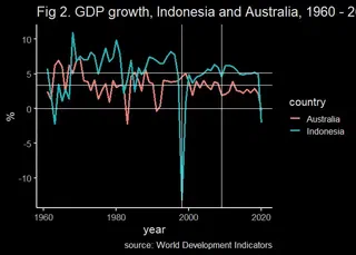
Fig 2 shows that the growth is not a smooth line: There are ups and downs. You can see how bad 1998 AFC does to Indonesia, while GFC decrease both countries’ growth but not much.
Question 2
Collect the data for nominal GDP (current year) and its four main types of expenditures: household consumption, government consumption, gross fixed capital formation, and net exports. This is a bit annoying because I can’t find nex export in World Development Indicators.
indo<-as_tibble(WDI(indicator = c('NE.CON.PRVT.ZS','NE.CON.GOVT.ZS','NE.GDI.FTOT.ZS',
'NE.EXP.GNFS.CN','NE.IMP.GNFS.CN','NY.GDP.MKTP.CN'),country = 'IDN'))
ausi<-as_tibble(WDI(indicator = c('NE.CON.PRVT.ZS','NE.CON.GOVT.ZS','NE.GDI.FTOT.ZS',
'NE.EXP.GNFS.CN','NE.IMP.GNFS.CN','NY.GDP.MKTP.CN'),country = 'AUS'))
indoo<-tibble(
year=indo$year,
C=indo$NE.CON.PRVT.ZS,
I=indo$NE.GDI.FTOT.ZS,
G=indo$NE.CON.GOVT.ZS,
NX=(indo$NE.EXP.GNFS.CN-indo$NE.IMP.GNFS.CN)/indo$NY.GDP.MKTP.CN*100
)
indooo<-indoo %>% pivot_longer(!year,names_to='variable',values_to='value')
ausii<-tibble(
year=ausi$year,
C=ausi$NE.CON.PRVT.ZS,
I=ausi$NE.GDI.FTOT.ZS,
G=ausi$NE.CON.GOVT.ZS,
NX=(ausi$NE.EXP.GNFS.CN-ausi$NE.IMP.GNFS.CN)/ausi$NY.GDP.MKTP.CN*100
)
ausiii<-ausii %>% pivot_longer(!year,names_to='variable',values_to='value')
gindo<-graph+geom_line(data=indooo,aes(x=year,y=value,color=variable),size=1)+geom_vline(xintercept=2009)+geom_vline(xintercept=1998)+dark_theme_bw(base_size = 12)+labs(title = 'Indonesia')+geom_hline(yintercept=0)
gausi<-graph+geom_line(data=ausiii,aes(x=year,y=value,color=variable),size=1)+geom_vline(xintercept=2009)+geom_vline(xintercept=1998)+dark_theme_bw(base_size=12)+labs(title = 'Australia')+geom_hline(yintercept=0)
gindo+gausi+plot_layout(ncol = 2, guides = "collect")+ plot_annotation(
title = 'Fig 3. Component of GDP by consumption, Indonesia and Australia, 1960-2020',
caption = 'Source: World Development Indicators'
)
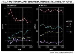
There are a few point we can discuss here. First up, while both countries generally export very similar things (natural resources), Australia runs long term trade deficit, while Indonesia mostly has trade surplus. Consequently, trade has higher GDP component in Indonesia.
In the context of developed vs emerging, it is generally true that developed countries have higher G. Make sense given their better capacity to tax and generally richer people with more population sit on the upper-ish tax brackett. In terms of combined private-government consumption, Australia is higher mainly because its government spend more (as a % of GDP).
Lastly, Indonesia’s GDP structure change a bit in the late 60s to late 90s due to its govermental transition. That is, consumption’s fraction of GDP goes down as investment go up. This is also a pivotal moment where Indonesia starts to grow faster (see fig 2).
One thing to note is while some countries may follow similar pattern, country’s economic growth and business cycle can be quite nuance and ungeneralisable. It depends on plethora of things: exposure to international market, political regime, etc. Some general insight is very useful especially if we are talking about small countries with high international exposure, but always be careful, be mindful of local wisdom and take everything with a grain of salt.
Try China vs US, for example. Will be fun.

My name is Krisna, some call me Imed. I am an advisor at the Indonesian National Economic Council. My research is about trade and investment policy and how it affects Indonesian firms. I use some structured equation such as GTAP model, but also do some empirics like gravity models.
I lecture at Universitas Indonesia. Additionally, I assume a senior fellow position at Center for Indonesian Policy Studies.
I contributed to several projects with Bank Indonesia, Bappenas, ADB, Prospera, and ERIA, among others. Occasional oped writer, typically at Kompas, Jakarta Post and East Asia Forum. Please see CV or contact me for more information.