Data
On Data
& Stats
Krisna Gupta
Krisna Gupta who? 👀
Associate researcher di CIPS.
Economics PhD Student di Australian National University.
Double degree Master in Econ dari UI / VU Amsterdam..
Research on trade & industry in Indonesia.
Blogs & sing in spare time. L’arc
enCiel fan.
Some publications 😎
About today
- Some intro
- Various ways data is presented
- Some stats
- Economic data
- Q&A
I assume y’all have never worked with data before
I try to allocate more for Q&A
Intro
Why?
Efficient & powerful to support your story.
- you don’t really need to be a math&stat-savy.
Shows how good you are in understanding an issue.
Objective, most of the time.
Everyone use ’em these days. Tough luck for data haters.
Data is getting mainstream
Some of my fave data source
- For trade, UN Comtrade https://comtrade.un.org/data/.
- General economic data, World Bank’s World Development Indicators https://data.worldbank.org/.
- Bank Indonesia (just google “SEKI Bank Indonesia”).
- BPS (either hit https://www.bps.go.id/ or query your keyword in google + ‘BPS’).
- ask them researchers.
Some jargons
Cross-sectional data: contains a snapshot of many subjects/individuals (people, countries, firms, etc) in a given time.
Time-series data: one subject observed for a long(-ish) periods of time.
- Good if trend is important.
Panel data: combination of the two.
Various ways data is presented
Cartesian plane
A 2-dimensional plane.
- pay attention to the x & y axis
Generally 2 forms: bar/column and line.
line chart is perfect for time series data.
- usually x=time, y=value. ex
bar chart usually for cross-section data.
- can be for time series too if you have one individual. ex
on values: check out the units!
Tables
Not the best visualization but very flexible. (ex)[https://comtrade.un.org/data/]
- easy to costumize with templates & other viz.
- can store many variables.
The most mainstream tools are microsoft excel & Google sheet.
- Hence It’s best to have a
.csvor.xlsxor something similar.
- Hence It’s best to have a
I certainly prefer working with these formats (among others)
Tables
- First row is usually shows variables.
- Note that a machine-readable tables are the best!
- i.e., it is better to have one row for variables.
- Example of bad machine-readability
Units in the X, Y and columns
Never lose sight of the units of your value.
- e.g., thousand or millions, kg or ton, etc.
Especially important if you use various data source.
- BI’s trade data is in 1000USD while Comtrade’s in USD.
Always read what’s X and Y.
- if you make the graph, always write what’s X and Y.
Some statistics
The need to aggregate
How to process an information of the income of 1 million people?
When we have data of 1 million people, it’s impractical to look at 1 million values.
We look for one number that represent these 1 million values.
- this is usually the average (or mean).
We also need to understand how the value is distributed.
- called standard deviation.
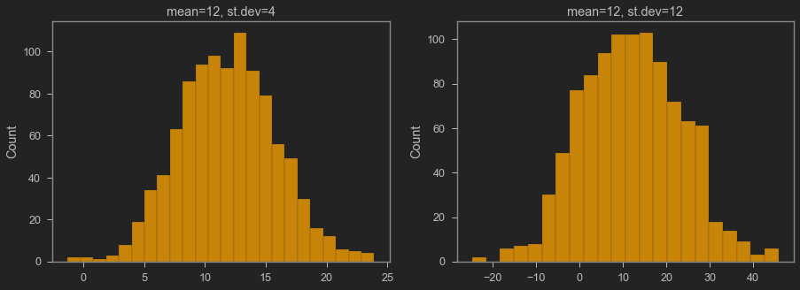
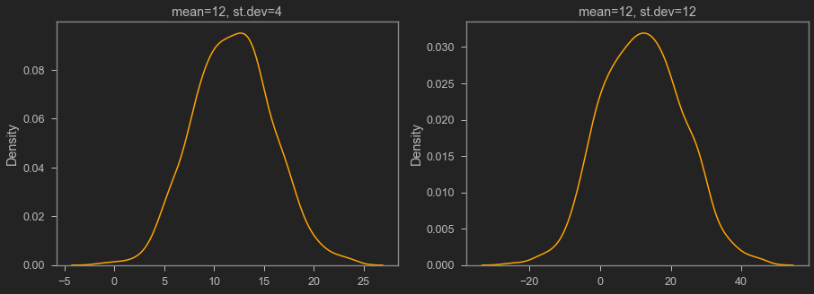
Normal distribution
If we group values, take frequency, then sort them, we can make a distribution plot.
We can make a smooth approximation of the distribution plot with functions.
The most famous distribution is the normal distribution
Normal distribution’s characteristics:
- frequency is highest around the mean
- the tail is skinny (i.e., frequency is very small in the extremes)
Normal distribution
Normal distribution
When to use median
Median is the value lying in the middle of the whole group if we sort the value.
If we have 1 million people:
- Sort their income from lowest to highest.
- Median is the income of the 500.000th person.
Median is often use in the presence of non-trivial number of extreme values (i.e., fat tail).
income is often not distributed normally, so median is better.
example in excel.
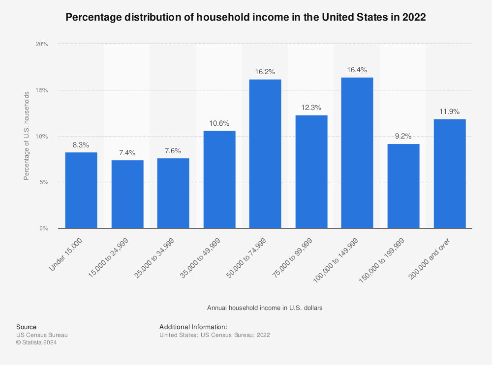
Find more statistics at Statista
Economic data
Real vs nominal
We use currency to express many economic variables.
We can’t aggregate car + food.
- we can 200 million + 50 thousand.
But really what we want is the car and the food, not the money.
We need to take into account change in prices (i.e., inflation)
Real vs nominal
Say a firm can make 1 car and 100 food in 2020.
The firm’s GDP is $1 \times 200 + 100 \times 0.05 = 205$
in 2021, car’s price is increase to 210, hence GDP becomes 215.
Increased GDP?
- not really, cuz the firm still just produced 1 car and 100 food.
Real vs nominal
It’s easy to imagine the complexity of this stuff in reality.
One thing is clear though: we want to exclude increase in GDP from price effect.
To avoid price effect, we use 2020 price so we can compare 2020 GDP with 2021 GDP.
Real GDP = When we use old prices.
Real vs nominal
Obviously to keep comparing, we still need to use 2020 prices when we calculate 2022 GDP.
also when we calculate GDP in 2023, etc.
Because we keep using 2020 prices, we say ‘constant price’.
- 2020 is called ‘reference year’.
- nominal GDP is calculate using ‘current price’.
- nominal GDP = constant real GDP in the reference year.
The constant price changes from time to time.
GDP vs GDP per capita
GDP is an aggregate of the whole economy.
- used to show how big & important the country is.
GDP per capita is the mean/average
- used to reflect living standard & productivity.
Singapore vs Indonesia: rich vs powerful.
Fraction
Fraction is usually expressed with percent.
We use fraction to express how important an individual is to the group/population.
India imports 3.05 billion USD of CPO from Indonesia doesn’t say a lot.
- India imports 61% of its CPO from Indonesia says how important supplier Indonesia is.
- From Malaysia ~32%, FYI.
Percent change / growth
Growth is important to reflect how fast something is changing.
Percent change is nice cuz it’s unit-free.
It linearizes non-linear thing, which’s good and bad.
If your income drop by 50% today, will 50% increase tomorrow get you back to your old income?
Index
Index is prolly the most confusing thing.
Index can be in many forms with many different weight.
- sometimes you might need to check its formula.
- the purpose of index is still to give us one representative number to reflect the big picture.
For example, consumer price index (CPI) calculates a change in price level of many consumer goods.
Indeks Kedalaman Kemiskinan shows how deep the poverty of some area is.
A note on CPI and similar indices
CPI and many other indicies are shown in number near 100.
That’s because CPI is calculated as compared to 100.
- 100 is the ‘base’, the year where CPI=100 is called reference year.
For example, if CPI in 2010=100 while 2020=154, that means prices in 2020 is 54% higher than 2010.
Q & A

Nama saya Krisna, sering dipanggil juga Imed. Saya adalah Tenaga Ahli Madya di Dewan Ekonomi Nasional. Riset saya tentang dampak kebijakan perdagangan dan investasi terhadap pertumbuhan sektor manufaktur di Indonesia. Saya menggunakan metode persamaan linear struktural seperti GTAP, tapi juga menggunakan berbagai teknik ekonometrika seperti gravity models.
Saya saat ini mengajar Program Sarjana Ilmu Ekonomi Universitas Indonesia. Saya juga adalah mitra senior di Center for Indonesian Policy Studies. Saya cukup aktif berkontribusi menulis di media massa seperti Kompas, Jakarta Post, dan East Asia Forum.